top of page


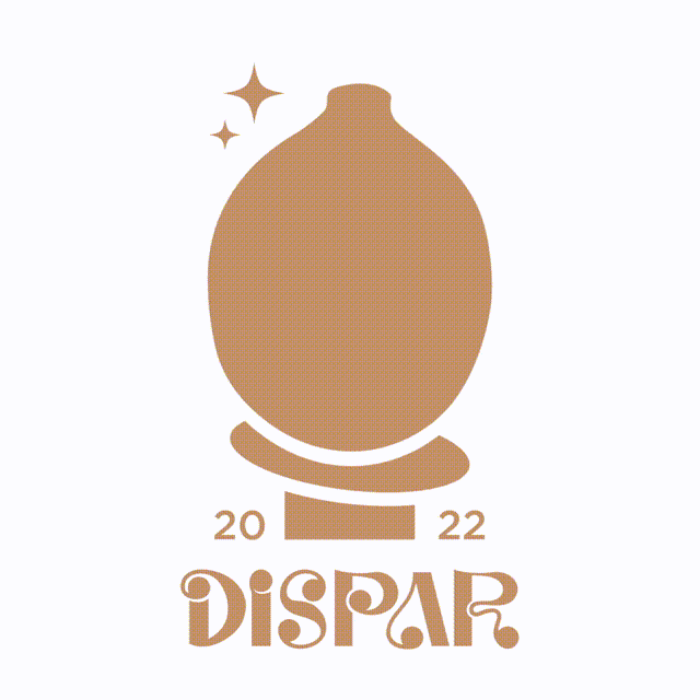
This is a branding project for an emergent pottery studio in the city of Barcelona.

Its a creative project with a strong ethic. They make 100% handcrafted products, therefore, unique pieces that combine utility and beauty.


The brand name “Dispar” is a Spanish word that means two things, different or uneven. The goal of this project was to represent this energy and give it a sober look.

Inspired by the shapes of their work I created a custom type that shows this “dispar” energy but still a refined look.


All their products have a flat base, so they are stable and practical for their use. For this reason, I have combined curved and organic shapes with straight lines and right angles to convey both concepts.

bottom of page